Nitesh Land is today one of India’s most recognized luxury brands and has been valued in different forums as one of India’s top luxury brands*.
- Voted as one of “Indian Luxury’s most influential Brand’ – Blackbook Top 100”
- Voted as India’s top 10 developers in hospitality for The Ritz-Carlton Hotel, Bangalore – the Track2Realty report.
- Voted in the Hot 100 Developers – “the most influential Players in the Real Estate & Infrastructure Sector” – Construction Week.
- Featured in Forbes – “Treasure Hunt” as one of Ten stories of businesses that made money in sectors that were never on anyone’s radar.
- We have also had partneships with some of the worlds best like The Ritz-Carlton Hotels, Goldman Sachs and ITC Limited amongst others.
Expect More
The Nitesh Land credo is “Expect More”.
The Corporate Tag Line states the basic position and promise of the brand, helping to create a distinct and consistent message across all marketing and communications.
The act of doing that little extra in each development – “Expect More” defines the promise of the brand, Customers can experience it across our asset classes Office buildings, Warehouses, Data Centres and Retail.
Evolution of the Brand
After a decade of operations the brand has evolved.
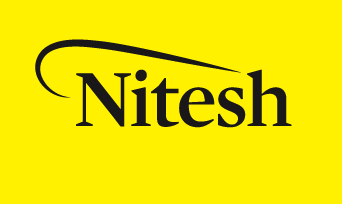
The name Nitesh Land coupled with an arc , houses the name. The use of the fluid arc over the word Nitesh makes a metaphorical roof. The line of the fluid mark connotes motion and signifies the growing breadth of Nitesh’s properties. A combinations of the typography, the colors and use of the arc collectively create a sense of a contemporary corporation that has heritage but is optimistic and fluid while being powerful and capable of positive growth.
Colors & Typography
Strong colors and typography personifies the brand.. The color yellow is the signature color of Nitesh for many years. It is powerful and optimistic. The logo itself is composed in a trending font Mercury Text
The colors and the typography draw attention to the brand and its promise.
Brand Symbol
The logo for Nitesh Land contains a shape that reflects Nitesh Land’s foundation in property development. The arc visually represents a modern take on a roof that houses the logotype. This roof-like shape adds a modern flare to the traditional serif typography.

#winningthefuture
Nitesh Land is a young brand, a first-generation real estate company is bankable and focused. We never wait for opportunities to win the future. We create our opportunities. Go-getters always believe the secret of winning is most often not quitting. Nitesh Land is moving forward to the relentless pursuit of success. We are poised to #winningthefuture.
Our other Brands

Nitesh HUB
Our Corporate logo for Retail business. As the name describes, it is a single point at the heart of the city for retail, entertainment and socializing spaces. It is where these experiences converge.
Our symbol is an abstract representation of this idea. It is a means of representing the location of this physical space, which has been created with respect to its location on the map. Therefore, the outer-form of the symbol is inspired by the map of the location and the inner-form conveys the idea of converging at a point within the location. This point corresponds to Nitesh HUB’s physical location in the map.
The structure of this symbol keeps changing from one city to the next as it is defined by its geographic location.

This City-Specific Logo is the consumer-facing identity of Nitesh HUB. It is unique to each city having our Retail presence.